On this page
Why I built Flood Atlas Nepal from the United States
A personal case study about turning fragmented flood information into one calm, bilingual, source-linked place I could confidently share across countries.
Living in the United States did not make floods in Nepal feel distant. In some ways, the distance made them harder to understand.
When something happened back home, I would open several tabs and several conversations at once. An official agency might publish a bulletin. A news organization would report what people were seeing. Facebook groups and WhatsApp groups would circulate local updates. Reddit threads would collect questions from people trying to understand the situation from abroad. Family and friends would add the context that never fits neatly into a public notice.
Useful, official information already existed. The difficulty was that each piece lived inside a different system, used a different vocabulary, and assumed a different level of familiarity with Nepal.
Friends in the U.S. would ask me what a place name meant, how close it was to another town, whether a screenshot was current, or whether a report came from an official source. I could answer, but every answer required an extra explanation. There was no single source I felt confident sharing without additional context.
Flood Atlas Nepal began with a very personal need: one calm link that I could send to someone and trust that it would explain itself.
The problem was not a lack of information
Nepal has government agencies, monitoring systems, emergency services, journalists, researchers, and community networks doing essential work. I wanted to make their information easier to navigate together.
The problem was fragmentation. A hydrology source could tell me one thing, a government briefing another, and a local report something else. A message shared in a personal network might be the fastest way to learn that something had happened, but not the easiest way to verify it or explain it to another person. Even accurate information can become difficult to use when its source, time, geography, and level of certainty are separated from it.
That fragmentation becomes more visible from another country. People in Nepal may already know that Rasuwagadhi, Syabrubesi, Betrawati, Galchhi, Malekhu, and Devghat belong to the same river corridor. A friend in Washington, D.C. usually does not. A place name in a headline is not enough if the reader cannot locate it or understand its relationship to the event.
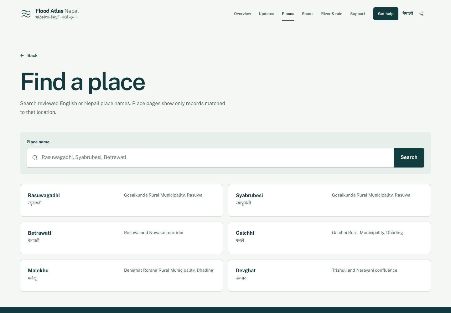
The place finder became one of the most important parts of the project because the geography is part of the explanation. Searching for a place should help a reader move from a broad story about flooding in Nepal to a specific community, with the original Nepali name still visible.
One link I could share
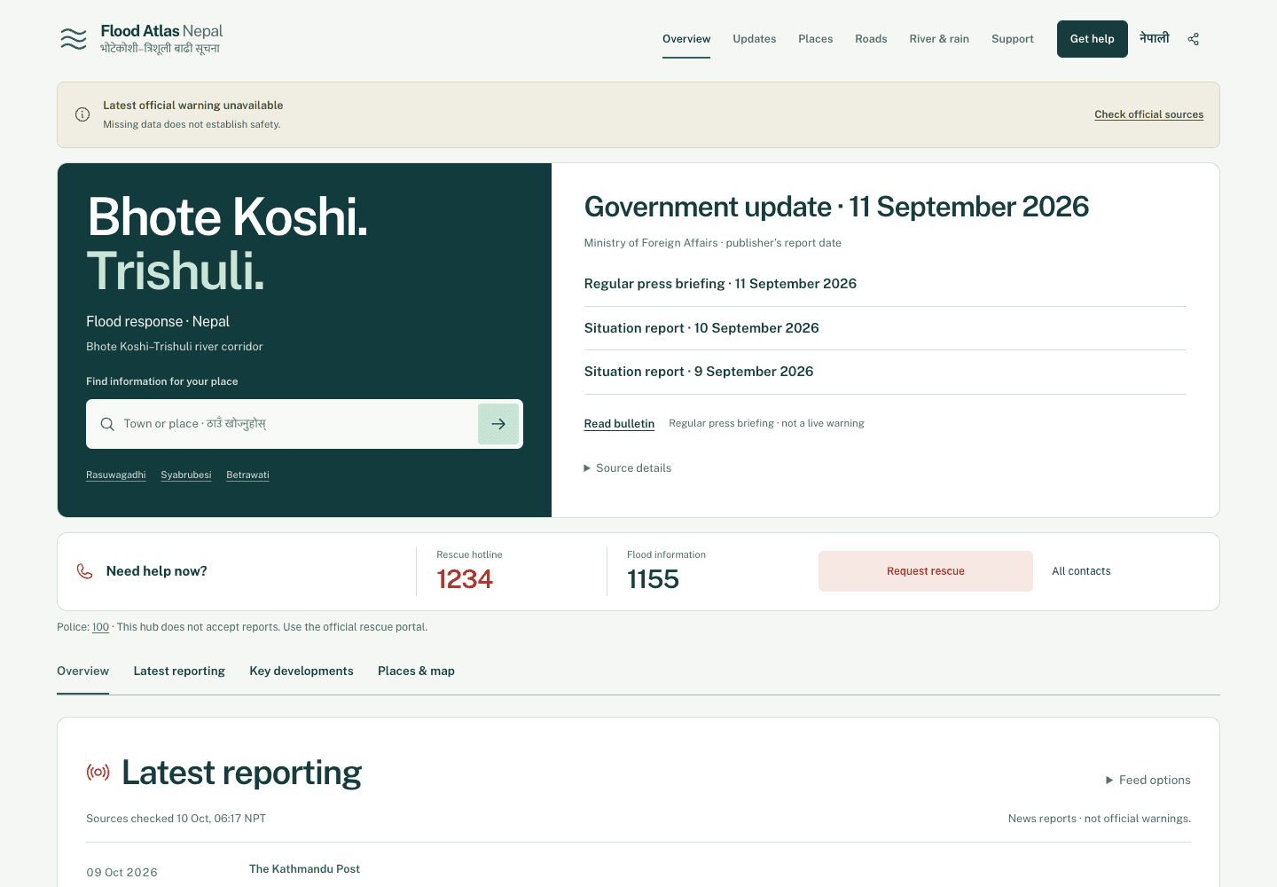
The homepage is organized around the questions I found myself answering repeatedly: What is the latest official update? Is a warning currently available? Where can someone find emergency contacts? What places are involved? Which reports are official, and which are reporting or supporting evidence?
The page does not try to collapse those answers into one confident status. Instead, it keeps them close enough to understand together while preserving their differences. Government briefings remain government briefings. News reports remain reports. Emergency actions lead to the responsible services. Place pages provide geographic context. Evidence pages explain what an image or observation can support.
A single link should reduce the amount of interpretation a reader has to borrow from me while leaving the sources open to inspection.
Bilingual by design
Nepali was never meant to be a translation added after the English interface was complete. It is part of the product's identity.
English helps me share the project with friends, classmates, and colleagues in the United States. Nepali keeps the interface connected to the language used by communities, sources, and place names at home. Showing both names also helps diaspora readers connect the spelling they see in English reporting with the place they know in Nepali.
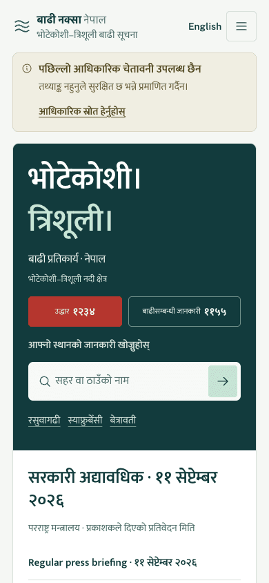
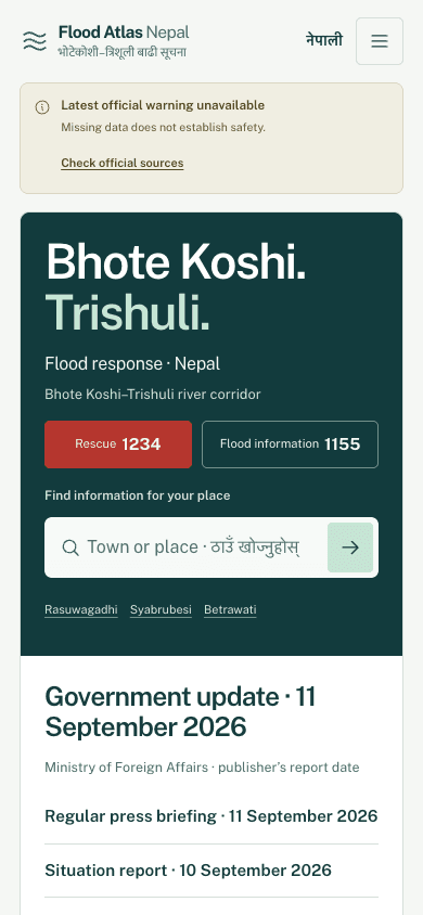
The mobile version received particular attention because an emergency information page cannot assume a large screen, a quiet room, or a reader willing to explore every section. Warning availability, emergency numbers, place search, and dated official context need a sensible reading order before any map appears.
Trust lives in visible details
I wanted the interface to feel calm, but not artificially clean. Public information becomes misleading when visual simplicity removes the details needed to judge it.
Publication time, retrieval time, source identity, and evidence type stay visible. If a source or measurement is missing, the interface says Unavailable. Missing information never quietly becomes zero, normal, open, or safe. Source reachability, content freshness, and evidence status are treated as different conditions because they answer different questions.
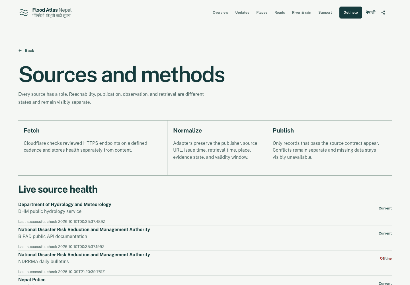
The color system follows the same principle. Teal, mint, and mountain-inspired neutrals give the site a sense of place without turning a disaster into spectacle. Red is kept mostly for urgent actions such as the rescue hotline, so it does not compete for attention across the whole page.
The site also avoids graphic victim imagery, animated casualty counters, donation pop-ups, and manufactured urgency. Respectful disaster communication should help someone understand and act. It should not use another person's crisis as visual drama.
Emergency and donation actions leave Flood Atlas Nepal for the responsible official service. The project does not collect rescue requests, donor details, or payment information. Knowing what a product should not own is part of designing it responsibly.
Explaining geography without overstating evidence
Mountain geography is difficult to understand from a list of place names. The optional terrain view gives readers a sense of the valley's shape and the relationship between communities along the Bhote Koshi and Trishuli rivers.
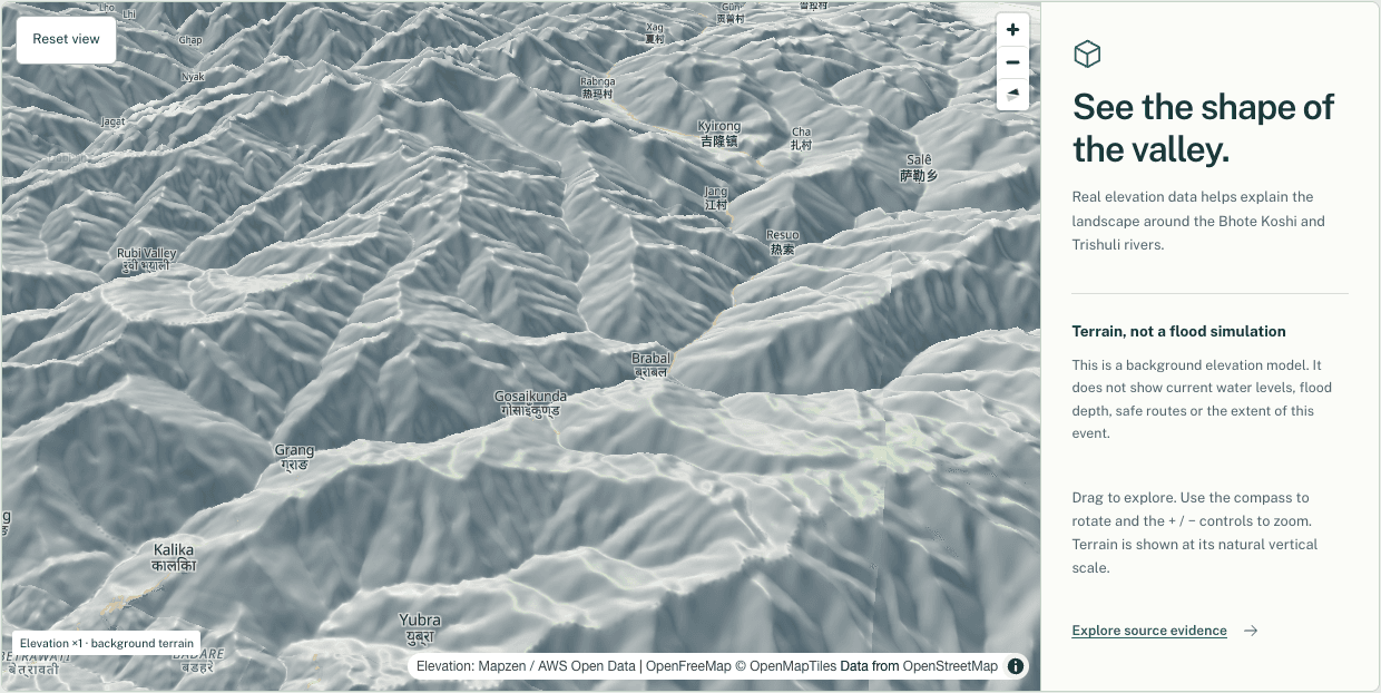
The terrain is background elevation. It does not show current water levels, flood depth, safe routes, or the extent of an event. A visually persuasive map can imply more authority than the underlying data supports, so the limit has to remain beside the feature.
Satellite imagery needs the same care. Before-and-after images can help a reader see visible change, but they cannot independently establish every cause, impact, or safety condition.
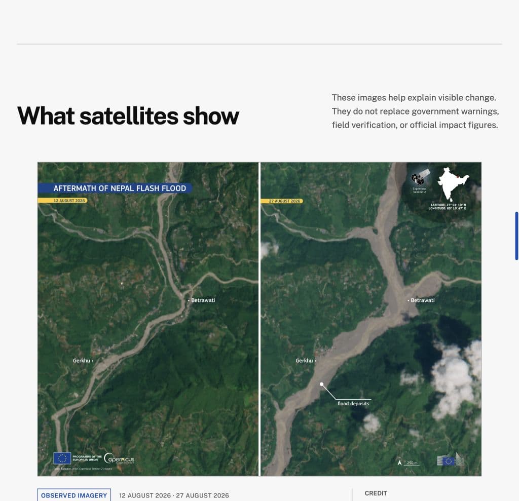
This is why the evidence model separates observed, reported, and preliminary information. Scientific context should not become an official warning by implication. The interface should help readers understand what they are looking at and where its authority ends.
The calmer design came later
An earlier design put the entire river corridor at the center of the first screen. It made the geography immediate and gave the project a strong visual identity. It also made the site feel more like an emergency dashboard.
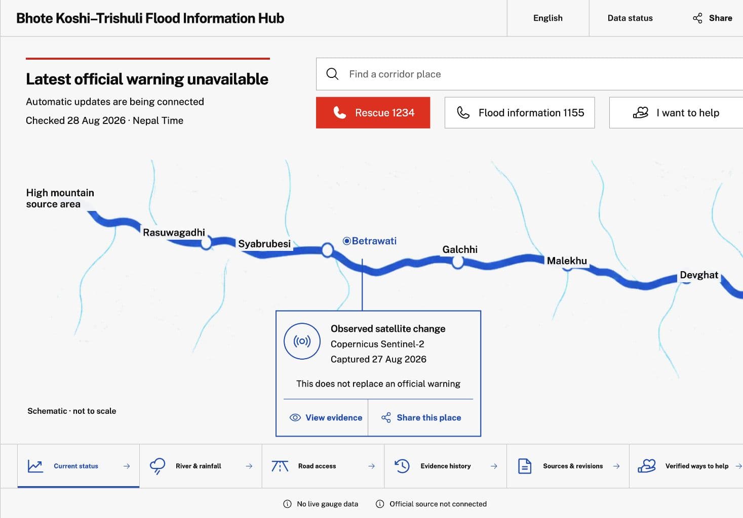
The final homepage gives urgent text, emergency actions, and dated official context priority. Geography is still available, but it no longer asks the reader to decode a large schematic before learning what is known. That change taught me that a memorable interface is not automatically the most responsible interface. In public-interest work, restraint can be a product feature.
What the technology is for
Flood Atlas Nepal uses Next.js, React, and TypeScript, but the stack is only useful insofar as it supports the communication goals.
Essential content is server-rendered so warnings, emergency contacts, source links, and summaries do not depend on client-side JavaScript. English and Nepali routes share a product structure while preserving authored Nepali interface text and original-language reporting. Reviewed source adapters retain publisher identity, original URLs, issue or observation time, retrieval time, place, evidence state, and validity windows.
Durable snapshots keep the last valid information available when an upstream source fails. Cloudflare services support ingestion, health checks, normalized records, and the reviewed place registry. Scheduled collectors and private storage support government bulletins, relevant reporting, and rainfall forecast snapshots. MapLibre powers the optional terrain experience.
River gauge readings, rainfall readings, and DHM warnings are not parsed yet, so those pages say the data is unavailable and link out to DHM and BIPAD instead of showing numbers. Government briefings, relevant reporting, and rainfall forecast snapshots are the parts collected on a schedule. I would rather leave a visible gap than make automation look more complete than it is.
What I learned across countries
Building this project changed how I think about public-interest technology. The hardest part was not assembling more information. It was deciding what relationship each piece of information should have to the reader.
Trust came from small decisions repeated across the product: keeping dates visible, naming sources, preserving Nepali place names, distinguishing a report from an observation, admitting when something was unavailable, and sending emergency actions to the organizations responsible for them.
Living in the United States shaped the project because I was constantly moving between contexts. I understood why a local update mattered, but I also saw how much background someone outside Nepal needed before that update became meaningful. Flood Atlas Nepal became a bridge between those perspectives.
The emotional center of the project is still the line in its footer: Connected communities. Clearer information. That is what I wanted the technology to make possible.
Takeaway
Public-interest technology becomes useful when it helps people understand what is known, what is missing, and where to go next without manufacturing certainty.