Question
What was the hard part?
Course planning needed graph reasoning, not another confident chatbot.
AI/ML Systems
Built a Knowledge Graph-RAG advising system for course planning. Fine-tuned Llama 3.1 with LoRA and made prerequisite reasoning visible in the interface.
Evidence board
A graph-first advising system where the interface exposes the reasoning path instead of asking students to trust a black box.
Question
Course planning needed graph reasoning, not another confident chatbot.
System
Python / Llama 3.1 / LangChain / RAG
Evidence
Graph-grounded training improved multi-hop reasoning from the 26% baseline.
Decision
GPU limits and advising risk pushed the interface toward visible reasoning and advisor checks.
Artifacts linked above
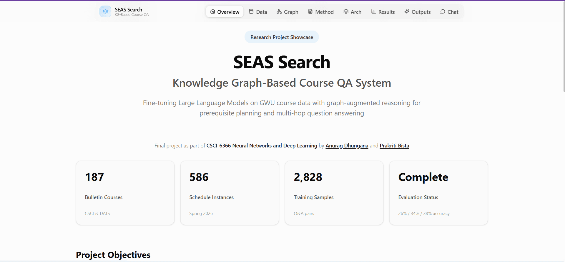
This was the final project for CSCI 6366, Neural Networks and Deep Learning at GWU's School of Engineering and Applied Science. A team project with my classmate Anurag Dhungana. We had a semester to build something real using what we'd learned, and we wanted to pick a problem we actually felt.
The problem we picked was one every SEAS student has hit: trying to figure out which courses you need before you can take the one you actually want. The official GWU systems are fragmented, the course bulletin is a PDF, the schedule is a separate portal, and prerequisite chains require you to manually trace through multiple pages. We wanted to build something that could answer the question naturally: "What do I need to take before CSCI 6364?"
The obvious first move was fine-tuning a language model on course data. We did that. It worked for simple questions. But it completely broke on anything that required tracing a chain. Language models don't naturally reason about structured relationships. They pattern-match. They hallucinate. They'd give you a confident wrong answer about prerequisites that didn't exist.
Design Decision
Course relationships are a graph problem wearing a text costume.
Prerequisites form a directed acyclic graph. If you want to answer multi-hop questions correctly, you need something that can walk that structure, not just retrieve text that sounds nearby. That's what pushed us toward building a knowledge graph.
System architecture
scraped
GWU schedule
my.gwu.edu · Spring 2026 · 586 rows
scraped
Course bulletin
CSCI + DATS · 187 courses
NetworkX DiGraph
Knowledge Graph
Nodes: course · professor · topic — Edges: prerequisite · taught_by · covers_topic (489 nodes / 566 links)
Student question
“What do I need before CSCI 6364?”
serialized subgraph
Structured context
The resolved prerequisite chain, as text
Unsloth · LoRA
Llama 3.1 8B (4-bit)
Fine-tuned on 2,828 Q&A pairs; r=32
answer
Grounded natural-language reply
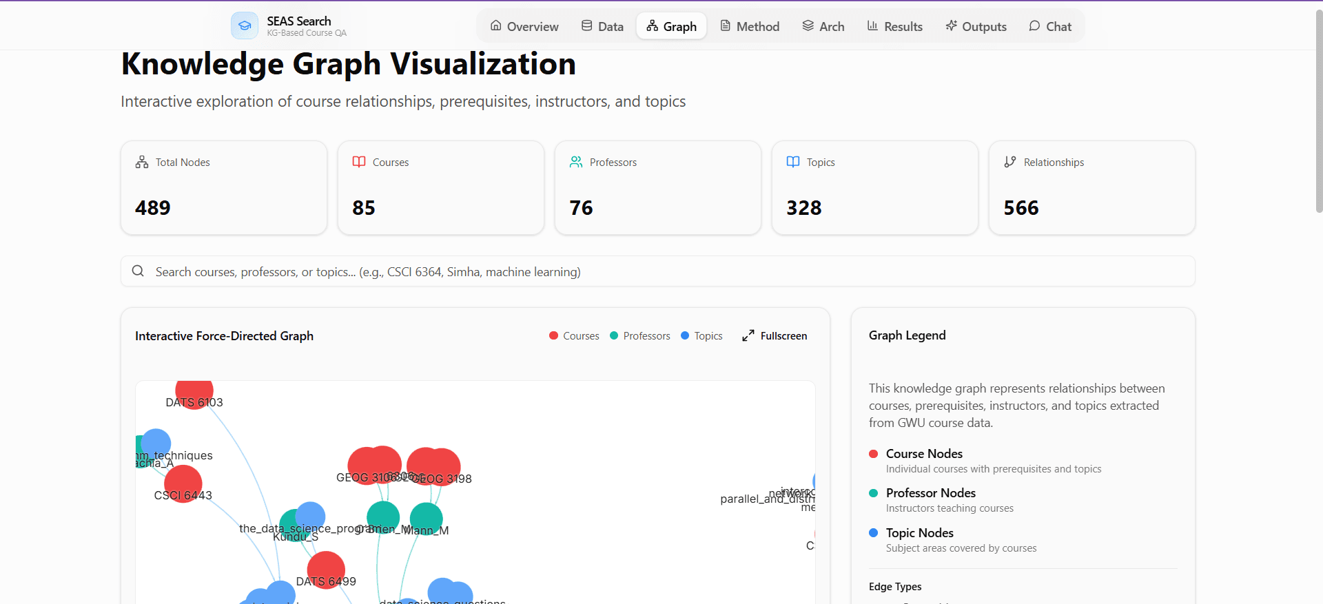
React force-graph lets you trace the path yourself
We scraped and structured data from two sources: the GWU CSCI and DATS course bulletin (187 courses) and the Spring 2026 course schedule (586 instances). From that, we built a knowledge graph in NetworkX where nodes are courses and edges are prerequisite relationships. spaCy handled the entity extraction from the bulletin text.
The graph became the backbone for our QA system. At query time, instead of handing the question straight to the model, we first traversed the graph to resolve prerequisite chains, then passed that context to the language model. The model's job changed from "figure out what the prerequisites are" to "explain the prerequisites I've already found."
Visual Evidence
Image
For the language model, we fine-tuned Llama 3.1 8B using LoRA adapters via Unsloth. We generated 2,828 training Q&A pairs: a mix of simple factual questions and complex multi-hop questions. LoRA meant we weren't fine-tuning all 8 billion parameters. We were adapting a small set of low-rank matrices, which made the whole thing feasible on academic resources: 14x less data and 25x faster than full fine-tuning.
We didn't get to the Knowledge Graph approach immediately. We went through four approaches across the semester.
The first two were baseline experiments: fine-tuning without graph augmentation. These handled factual lookups reasonably well but failed on relational reasoning. Accuracy on multi-hop questions: 26%.
The third approach introduced the Knowledge Graph as a retrieval mechanism but didn't train the model with graph-augmented examples, better, but inconsistent.
The fourth approach trained the model on graph-grounded examples so it would learn to use the retrieved context. On held-out multi-hop questions it landed around 34%, and it got there on a fraction of the training pairs the other runs used. Our longest standard run actually scored a touch higher, 38%, which taught us something uncomfortable: a lot of the jump from 26% came from better training, not from the graph alone.
So the graph's real win isn't on this scoreboard. It shows up at answer time, where traversing an actual prerequisite chain stops the model from confidently inventing one. A benchmark point or two is easy to argue about; a system that doesn't hallucinate the courses you need is the thing that actually matters here.
Fine-tuning runs · multi-hop accuracy
Standard fine-tune · 2,828 pairs, r=16, 4 epochs
26%
KG-grounded fine-tune · 195 multi-hop pairs, r=32
34%
Optimized fine-tune · 2,828 pairs, r=32, 6 epochs
38%
Building the frontend raised a design problem the model work didn't: how do you build an interface for a system that's partially correct, where the stakes of being wrong are real? A student asking about prerequisites might use the answer to decide what to register for.
The choice to use a chat interface rather than a search box was deliberate. Chat implies reasoning rather than fact retrieval, which is more honest for this system. More practically, chat lets students ask in the language they already use. "What do I need before 6364?" is a question a student would ask an advisor. Forcing that into a structured query form adds work for no real benefit.
The interface distinguishes between simple factual lookups and graph traversal queries. They get different visual treatment. A factual lookup shows a compact answer. A graph traversal query shows which part of the graph was traversed and what relationships were resolved before the model generated its answer. That's model confidence through design, without asking a student to interpret a probability score.
For anything touching graduation requirements or prerequisite chains, the output card includes an active prompt to confirm with an academic advisor, as prominent as the answer itself, not a disclaimer tucked at the bottom.
Design Decision
The language model was the same throughout. What changed was how we structured the knowledge, and that's what stopped it from making things up.
This project was my first time working with knowledge graphs seriously, and the thing that stuck with me was how much the data representation matters. The graph-grounded model trained on far fewer examples than the others, but structuring the knowledge as a traversable graph is what let it follow a real prerequisite chain instead of hallucinating one. That's a different kind of win than a higher benchmark, and a more useful one.
That insight carried into the interface. Because the data was structured as a graph, the interface could show graph-level concepts to users. The interactive visualization was only possible because the underlying data had that shape. If course relationships had been stored as unstructured text or a flat table, there would have been nothing useful to show.
Data architecture and UX are not separate decisions. How you structure your data determines what your interface can show.
What Worked
What Didn't
Built with